
Great Books Deserve
Beautiful Pages
Great Books Deserve Beautiful Pages
Professional book interior design that makes every page inviting, readable, and distinctly yours.
A professionally designed book is more than words placed on a page. Typography, margins, spacing, chapter openings, headings, images, page numbers, running heads, and countless small details work together to create a comfortable and engaging reading experience. I design book interiors that complement the subject, audience, and personality of each book while meeting professional publishing standards for print and digital distribution.

Curated Editorial Typologies
Explore Different Interior Styles
Every genre asks for distinct typographic architecture, pacing, and ornamentation. Select a style engineered specifically for your narrative.

Fiction & Essays
Classic & Literary
Elegant serif typography, generous margins, traditional chapter openings, refined running heads, drop caps, and understated ornamental details.

Poetry & Design
Modern & Minimal
Clean typography, generous white space, contemporary chapter openings, simple page furniture, and a sophisticated editorial appearance.

Non-Fiction & Strategy
Business & Professional
Strong information hierarchy, readable typography, callout boxes, charts, bullet lists, tables, sidebars, and clearly organized sections.

Narrative & Heritage
Memoir & Biography
Warm readable typography with archival photographs, refined captions, historical quotations, timelines, and distinctive chapter openings.
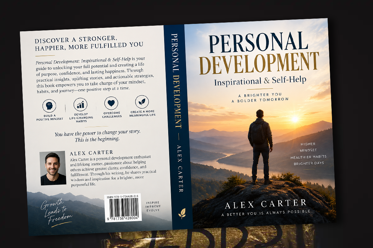
Personal Development
Inspirational & Self-Help
Inviting typography with pull quotes, practical exercises, reflection boxes, highlighted ideas, chapter summaries, and engaging page layouts.

Visual Monograph
Image-Rich / Coffee Table
Large photography, dramatic spreads, subtle captions, controlled typography, and imagery and text unified as a single harmonious composition.
Gallery & Reading Experience
See How Interior Design Changes the Reading Experience
Browse published spreads across multiple trim sizes, binding formats, and editorial genres. Each demonstrates calibrated tracking, line height, and margin balance.
Filter Spread Catalog
ALL EDITIONS • CLASSIC • MODERN • MEMOIR • COFFEE TABLE

The North Passage — Historical Fiction
6 × 9 in • Hardcover • Caslon • 440 pp

Forms in Stone — Monograph
8.5 × 11 in • Thread-Sewn • Grotesque • Duo-Tone

Operational Clarity — Business Leadership
5.5 × 8.5 in • Paperback • Minion Pro • Index & Tables
The Mechanics of Reading
Good Interior Design Is Almost Invisible
The reader should never have to think about the design. The pages should simply feel comfortable, organized, and easy to read. Achieving that simplicity requires careful decisions about typography, spacing, hierarchy, page proportions, and hundreds of small details throughout the book.
Typography
Careful typeface pairing, optical kerning, x-height balance, and line measure tailored for sustained visual endurance.
Margins & White Space
Gutter depth configured precisely for paper bulk, binding pinch, thumb placement, and serene outer boundaries.
Running Heads
Unobtrusive book title and chapter navigation placed with restrained typographic spacing and quiet hairline accents.
Page Numbers
Folio alignment placed logically across verso and recto sides, suppressed systematically on chapter starts and display leaves.
Chapter Openings
Distinctive sinkage, numeral styling, subtitle pacing, and introductory drop caps that announce each part with authority.
Pull Quotes
Carefully anchored breakout passages that provide rhythm without breaking the underlying grid or narrative thread.
Widows & Orphans
Manual page-by-page tracking and line balance adjustments so no stray words hang isolated at page tops or bottoms.
Print Production
Exact bleeds, vector font embedding, CMYK color spaces, and certified PDF/X delivery for KDP and IngramSpark.
The Typesetting Difference
From Manuscript to Professionally Designed Book
Same words. Completely different reading experience.
Author's Manuscript
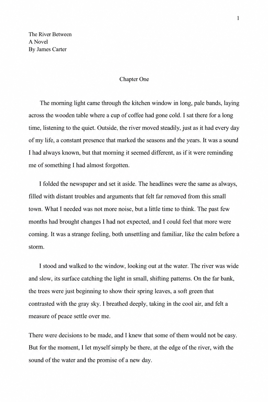
Default system fonts, harsh uncalibrated margins, auto-hyphenation traps, and zero narrative hierarchy.
Transformation
Professionally Designed Interior
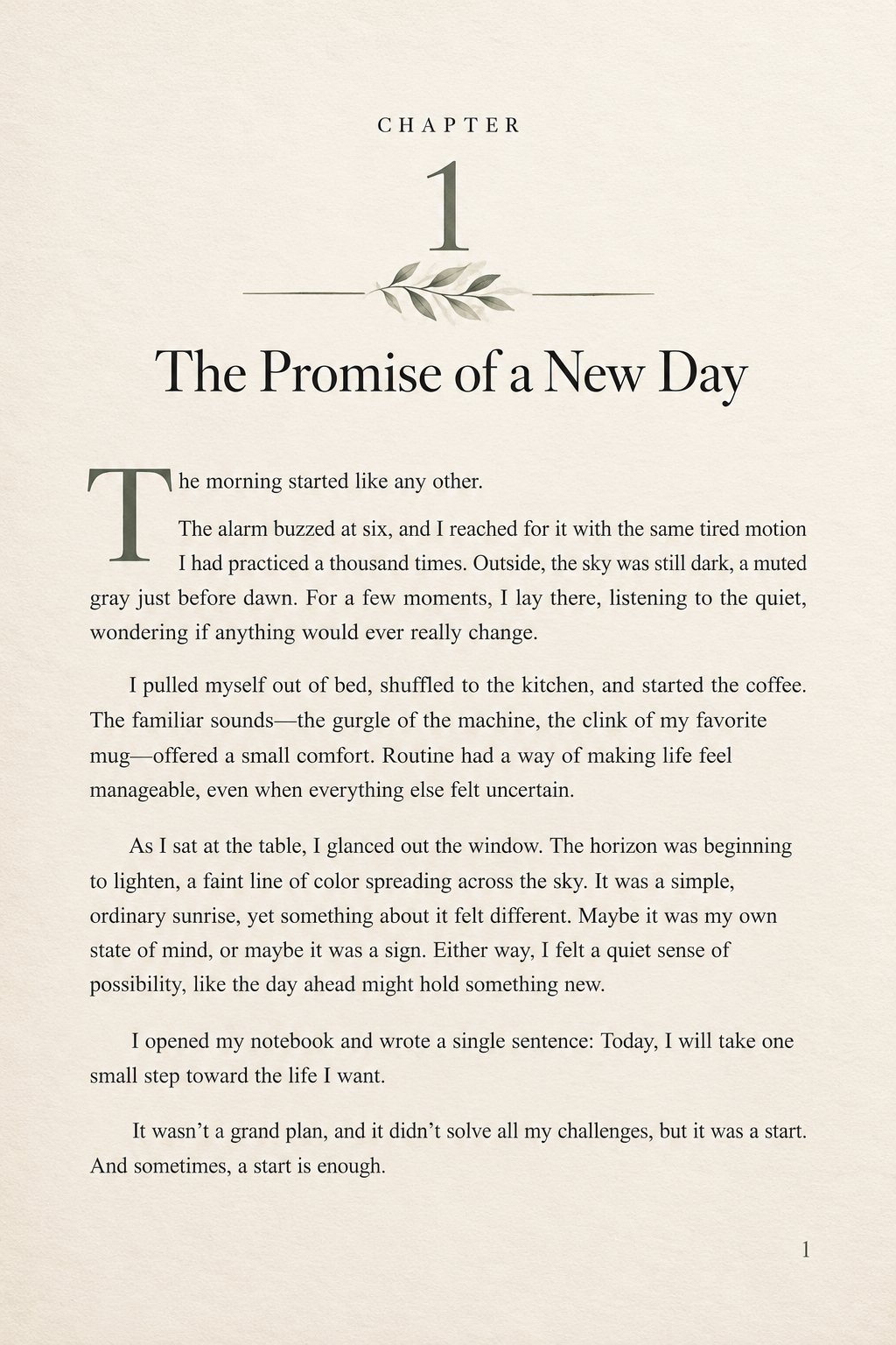
High-contrast literary typography, breathing margins, balanced running headers, and bookmaker-grade typesetting.
Ready For Publication
Your Cover Gets Their Attention. Your Interior Keeps Them Reading.
Whether you are publishing through Amazon KDP, IngramSpark, or another platform, your book should look professionally produced from the first page to the last.